
Have you ever walked into a room and felt an instant sense of elegance and visual balance? You do not need a massive budget to make your home look incredibly luxurious. In fact, achieving a high-end, cohesive aesthetic has very little to do with spending a fortune. Instead, it relies on a strict adherence to the laws of scale, visual hierarchy, and spatial geometry. When design guidelines are ignored, even the most expensive furniture can look uncoordinated and cheap. However, by implementing professional styling secrets, you can elevate your space into a stunning showcase of style.
This comprehensive guide reveals 27 pro-level home decor ideas to upgrade your space. Each idea is grounded in systematic design science, from the exact mathematics of area rugs to the architectural alignment of window treatments. By following these simple guidelines, you can turn any standard house into a polished, high-end haven that looks effortlessly curated.
Part 1: The Geometry of Textiles (Rugs & Curtains)
1. Mount Your Curtains “High and Wide”
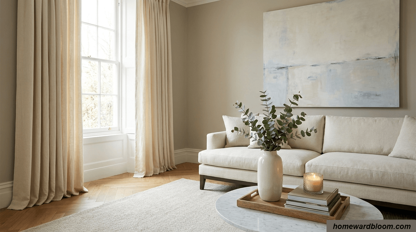
To create a designer look, you must alter how your brain perceives window proportions. You should never mount your curtain rods directly on the window frame. Instead, mount your rod at least 4 to 6 inches above the frame, and extend it 3 to 6 inches past the frame on each side. Consequently, the fabric panels rest on the wall when opened, letting in maximum light and making windows appear grander.
2. “Train” Your Drapes for Architectural Columns
Even high-quality drapery can look messy if the folds are uneven. Professional decorators use a simple trick called “training” to achieve uniform pleats. First, gather your fabric into even, accordion-style folds. Second, use loose ribbon to tie the folded panels together at the top, middle, and bottom. Finally, let them hang bound like this for 48 to 72 hours so they fall in elegant, crisp columns.
3. Ensure a Floor-Touching “Kiss” or Luxurious “Puddle”
A major sign of a cheap interior is “floating” curtains that hang above the floor. To look tailored, your panels must either touch the floor or pool elegantly. First, “the float” hovers just a half-inch above the floor for a clean look. Second, “the kiss” skims the floor’s surface, which looks custom-tailored. Lastly, “the puddle” pools 1 to 3 inches for a romantic statement.
4. Invest in Weighted, High-End Fabrics
The material of your window treatments dictates how they drape. You should choose heavier, textured fabrics over thin, skimpy ones. Belgian linen is an exceptional choice because it is stronger than cotton, crisp, and drapes beautifully. For a balanced look that provides insulation without too much heaviness, consider a blended fabric woven with linen and wool.
5. Ditch “Floating” Rugs with the Front Leg Rule
An area rug acts as a visual frame that anchors your entire seating arrangement. One of the most common decorating mistakes is using a rug that is too small, making it float in the center of the room. To ground your layout, ensure the rug is large enough that at least the front legs of your sofa and side chairs rest securely on it.
6. Maintain the “Bare Floor Border”
While rugs must be large enough to anchor your furniture, they should never run completely wall-to-wall. Running a rug to the edge of the wall makes it read as wall-to-wall carpet, which visually shrinks your room’s footprint. Therefore, always leave a border of 20 to 40 cm of bare floor between the rug and the walls to make the room read as larger.
7. Scale Your Rug to the Sofa’s Width
To ensure your rug looks proportional, follow a precise mathematical guideline. Specifically, your area rug width (Wᵣᵤg) should satisfy the following inequality:
Wᵣᵤg ≥ Wₛₒfₐ + 40 cm
This ensures that your rug extends at least 20 to 30 cm beyond each side of your sofa, creating a balanced foundation.
Part 2: The Color Theory & Spatial Psychology
8. Use the “Field, Supporting Cast, and Punctuation” Framework
Instead of treating color palettes like a rigid formula of 60%, 30%, and 10%, high-end designers think in terms of roles. The “Field” represents the dominant atmosphere (60%), while the “Supporting Cast” (30%) includes mid-ground elements like curtains and occasional chairs. Finally, the “Punctuation” (10%) consists of visually powerful colors used sparingly on accessories like artwork and lighting. This hierarchy prevents visual chaos.
9. Drench Your Walls in a Room-Brightening Creamy Neutral
To mimic the airy, expensive look of luxury hotels, choose your dominant “Field” color carefully. A neutral, room-brightening creamy white, warm greige, or soft beige is the perfect foundation. These tones bounce natural light efficiently and expand the perceived volume of the space. This neutral backdrop allows supporting colors to stand out with clear contrast.
10. Introduce Tonal Contrast with “Colour Capping”
If you want to make a bold, sophisticated statement, break away from plain white ceilings. “Colour capping” is an editorial design technique where you paint the ceiling in a rich, intense color while keeping the walls neutral. This creates a warm, enveloping effect that instantly transforms the entire atmosphere of a bedroom or living room. Pairing this with natural wood tones creates high-end drama.
11. Leverage Symmetry for Instant Grandeur
The human brain processes symmetry as formal and highly structured. Therefore, use symmetrical layouts to give a living room or bedroom an upscale, traditional backbone. For instance, place two matching armchairs flanking a fireplace. However, to keep the space from looking too stiff, always mix in asymmetrical, organic vignettes on smaller surfaces.
12. Introduce Unexpected “Color Tension”
One major pitfall in budget decorating is repeating your accent color too predictably in matching sets. This “matchy-matchy” look can make a room feel flat. Instead, expensive-looking spaces feature “color tension,” created by introducing a single, non-repeated color punctuation. For example, use a single cherry-red lampshade or an oxblood cushion that appears only once in the entire room, adding sophisticated visual intrigue.
Part 3: Custom Architectural Hacks (DIY Built-Ins)
13. Construct Faux Built-Ins Using Stock Bookcases
Nothing adds architectural permanence quite like custom library shelving. However, custom cabinetry can cost an absolute fortune. You can achieve this high-end look on a budget by executing the famous IKEA Billy bookcase built-in hack. First, build a solid base platform out of a 2×4 frame to elevate the bookcases. Second, secure the Billy bookcases on top of the base and anchor them directly to the wall studs.
14. Eradicate Flat-Pack Clues by Filling Peg Holes
The biggest giveaway that your built-ins are cheap flat-pack furniture is the rows of pre-drilled, adjustable shelf peg holes. To make your shelves look custom-milled, you must fill these holes. Once you finalize your shelf layout, use lightweight spackling paste (such as DAP DryDex) to fill every unused hole. After the paste dries, sand the surface completely smooth.
15. Integrate Shaker-Style Doors to Hide Lower Clutter
To make your DIY built-ins highly functional and expensive-looking, incorporate closed storage. You can easily attach compatible Oxberg doors to the lower section of your Billy bookcases. This conceals clutter while creating a Shaker-style cabinet appearance. Simply drill new hardware holes adjusted for front trim depth, ensuring doors open and close with a flush, custom fit.
16. Always Prep with a Shellac-Based Primer
IKEA Billy bookcases are constructed from composite wood finished with a non-porous melamine laminate. Consequently, paint will not naturally adhere, causing it to quickly chip and peel. To prevent this, mechanically sand the laminate with 120-grit, followed by 320-grit sandpaper. Afterward, apply two coats of a high-quality shellac-based primer, such as Zinsser BIN, to create an indestructible foundation.
17. Finish Bookcases with Detailed Millwork
To bridge the gap between stock bookcases and your home’s existing architecture, you must install trim and molding. First, run vertical 1×2 poplar trim boards over the vertical seams to make them look like one continuous unit. Second, install 5 1/4-inch crown molding to bridge the top gap to the ceiling. Finally, reattach your room’s original baseboards along the bottom base.
Part 4: The Art of Visual Clustering (Vignettes & Accessories)
18. Style Surfaces Using the “Rule of Odds”
Surface styling can easily look cluttered if items are arranged randomly. To make your displays feel balanced yet organic, group accessories in odd numbers—most notably three, five, or seven. Symmetrical even pairings look rigid, whereas odd numbers force the eye to perform continuous movement. Consequently, the brain registers the composition as dynamic and visually satisfying.
19. Create Tiers of Visual Weight (The 3-5-7 Scale)
When applying the Rule of Odds, you should ensure that your items vary in scale and visual weight. Specifically, the 3-5-7 scale dictates that the number of items corresponds to their size. Groupings of three are reserved for large, foundational anchor pieces. Groupings of five incorporate medium-sized supporting pieces, while groupings of seven add small, decorative details. Vary heights and materials for dynamic movement.
20. Corral Small Decorative Accents onto Trays
If you have small, loose treasures like candles or small plants, scattering them can create visual clutter. To maintain a clean, organized look, you should corral these items onto a decorative tray, wood board, or stacked books. Placing your accessories on a tray creates a clear visual boundary. Consequently, your brain reads the entire group as a single, organized visual unit.
21. Hang a “Conversation-Starting” Statement Piece
A common mistake that cheapens a living room is hanging a busy, mismatched collage of tiny picture frames. A cluttered gallery wall can easily look disorganized. To elevate your room instantly, choose one oversized, high-quality statement piece of art to act as the main focal point of the wall. One large-scale canvas creates a sophisticated gallery feel and makes the entire room feel grander.
22. Switch Out Builder-Grade Light Fixtures
Standard, builder-grade flush-mount ceiling lights are a dead giveaway of a budget home. Replacing cheap overhead fixtures with mid-century semi-flush mounts or brass chandeliers instantly upgrades your design story. Furthermore, you can install plug-in or battery-powered sconces on either side of a fireplace. This adds luxurious ambient lighting without the expensive cost of calling an electrician.
23. Swap Cabinet Knobs for Brushed Brass
You do not need to buy brand-new furniture to get a high-end look. You can easily elevate a standard IKEA dresser or your built-in lower doors by swapping out the cheap, builder-grade hardware. Swap them for heavy, high-quality knobs or pulls made of brushed brass, matte black metal, or polished nickel. This minor hardware upgrade acts as jewelry for your furniture.
24. Upgrade to High-Quality, Soft Bedding in Neutral Palettes
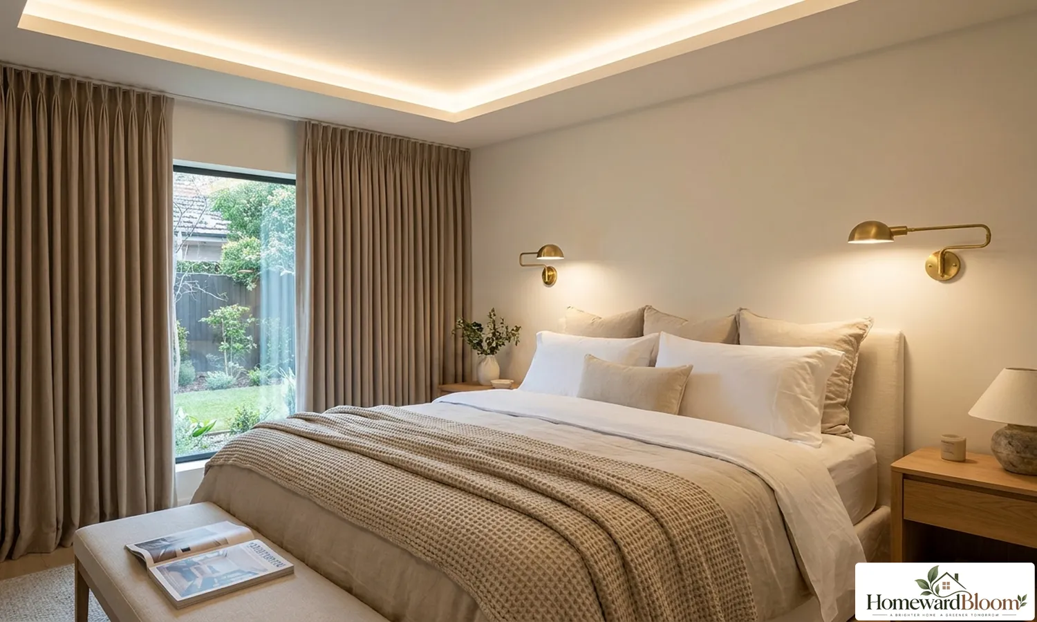
Your bedroom should feel like a luxurious, peaceful retreat. Cheap, synthetic bedding with busy, loud patterns can look chaotic. To achieve a high-end hotel look, invest in high-quality, breathable textiles like linen or organic cotton bedding. Choose a neutral, serene palette such as soft greige or warm white to keep the visual flow peaceful, and layer a heavy throw blanket for rich texture.
25. Elevate Your Bathroom with a Vintage Persian Rug
Standard, fuzzy terry-cloth bathmats are purely functional and can make a bathroom feel uninspired. To instantly inject character and luxury, replace your generic bathmat with a small vintage Persian rug or a colorful wool runner. A durable, flat-woven wool textile can easily withstand daily bathroom moisture. Furthermore, the rich, storied pattern adds warmth and visual comfort.
26. Balance Heirlooms with Clean, Modern Profiles
To prevent your home from looking like a sterile showroom, your space should look thoughtfully collected over time. This is the core of the popular “Fresh Transitional” style, which bridges classic and modern design. To create this high-end look, balance antique or inherited family heirlooms with clean, contemporary furniture profiles. For instance, pair a curved vintage table with a sleek modern sofa.
27. Execute the “Ruthless Editorial Purge”
Finally, the most effective way to make your home look expensive costs absolutely nothing: clearing out clutter. A crowded room looks visually compressed and functions poorly. Therefore, execute a ruthless editorial purge, donating any accessories that do not serve a purpose. To maintain a spacious feel, always maintain a minimum walkway clearance of 24 to 36 inches along all travel paths.
The Ultimate Checklist for an Expensive-Looking Home
To help you put these ideas into action, keep these key rules handy:
- Curtains: Mount 4-6 inches above the frame and 3-6 inches wider on each side. Panels should “kiss” or puddle on the floor.
- Rugs: Sofa front legs must rest on the rug. Maintain a 20-40 cm bare floor border from the walls.
- Built-Ins: Sand composite furniture, prime with shellac-based primer, fill every single peg hole, and finish with molding.
- Vignettes: Group items in odd numbers (3, 5, or 7) and vary their heights and materials.
- Pathways: Maintain at least 24 to 36 inches of clear walkway along travel routes to keep the layout feeling open.
Frequently Asked Questions (FAQs)
No. IKEA Billy bookcases are coated with a slick melamine laminate. If you paint directly onto this surface, the paint will bead up, fail to adhere properly, and chip off with the slightest scratch. You must sand the laminate lightly with a medium-grit sandpaper (around 120-grit followed by 320-grit) to create a mechanical key, and then apply a high-quality shellac-based primer like Zinsser BIN to guarantee maximum adhesion.
For a professional designer look, you should mount your curtain rod at least 4 to 6 inches above the top of your window frame. If you have tall ceilings, you can mount the rod even higher—up to 12 inches above the frame or just 2 inches below your crown molding. This draws the eye upward and makes your ceilings feel much taller than they actually are.
These terms describe how your curtain panels meet the floor. “The kiss” means the fabric barely grazes the floor’s surface, creating a crisp, custom-tailored appearance. “The puddle” allows the curtain panels to pool on the floor by an extra 1 to 3 inches, creating a soft, romantic, and highly luxurious aesthetic.
Instead of viewing the 60-30-10 rule as a strict mathematical formula, think of it as a spatial hierarchy. Your dominant color (60%) establishes the overall mood, the secondary color (30%) supports it through large textiles like rugs and drapes, and the accent color (10%) provides punches of interest. To prevent the room from looking too staged, introduce a tiny bit of “color tension” with a single, non-repeated punctuation color—like an unexpected cherry-red lamp or a cobalt vase—that breaks the pattern entirely.
To ensure your rug looks proportional and elegant, follow the front-leg rule and choose a rug that is at least 40 cm wider than your sofa:
Wᵣᵤg ≥ Wₛₒfₐ + 40 cm
This allows the rug to extend approximately 20–30 cm beyond each side of the sofa, helping anchor the seating area and create a balanced, cohesive look. A properly sized rug also prevents the furniture from appearing to “float,” which can make the room feel less polished.
Conclusion
Achieving an expensive-looking home has very little to do with how much money you spend, and everything to do with how thoughtfully you plan your space. By mastering the geometry of your textiles, embracing the balanced visual hierarchy of the Rule of Odds, and putting in the sweat equity to customize off-the-shelf furniture, you can completely shift the energy and value of your home. Real luxury lies in the details—the crisp hang of a trained drape, the clean boundary of a corralled tray, and the intentional editing of your personal belongings. With these 27 professional design strategies, you now have the exact blueprint to transform your everyday spaces into a polished, high-end sanctuary that feels uniquely yours and looks instantly more expensive.
Comment on “27 Home Decor Ideas That Will Make Your House Look Instantly More Expensive”